public static function Label(text:
string,
params options: GUILayoutOption[]):
void;
public static void Label(string text,
params GUILayoutOption[] options);
public static function Label(image:
Texture,
style: GUIStyle,
params options: GUILayoutOption[]):
void;
public static function Label(text:
string,
style: GUIStyle,
params options: GUILayoutOption[]):
void;
public static function Label(content:
GUIContent,
style: GUIStyle,
params options: GUILayoutOption[]):
void;
Parameters
| text | Text to display on the label. |
| image | Texture to display on the label. |
| content | Text, image and tooltip for this label. |
| style | The style to use. If left out, the label style from the current GUISkin is used. |
| options | An optional list of layout options that specify extra layouting properties. Any values passed in here will override settings defined by the style.See Also: GUILayout.Width, GUILayout.Height, GUILayout.MinWidth, GUILayout.MaxWidth, GUILayout.MinHeight, GUILayout.MaxHeight, GUILayout.ExpandWidth, GUILayout.ExpandHeight. |
Description
Make an auto-layout label.
Labels have no user interaction, do not catch mouse clicks and are always rendered in normal style. If you want to make a control that responds visually to user input, use a Box control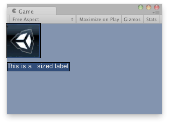
Label in the Game View.
    // Draws a texture and a label after the Texture
    // using GUILayout.
    var tex : Texture;

    function OnGUI() {
        if(!tex) {
            Debug.LogError("Missing texture, assign a texture in the inspector");
        }
        GUILayout.Label(tex);
        GUILayout.Label("This is an sized label");
    }
using UnityEngine;
using System.Collections;

public class ExampleClass : MonoBehaviour {
    public Texture tex;
    void OnGUI() {
        if (!tex)
            Debug.LogError("Missing texture, assign a texture in the inspector");

        GUILayout.Label(tex);
        GUILayout.Label("This is an sized label");
    }
}